Apple's Liquid Glass UI gets more matte after user complaints
08 Jul 2025
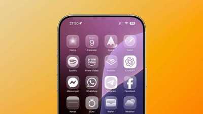
Apple's latest update to its Liquid Glass design language has taken a more frosted approach.
The change was first spotted in the third developer beta of iOS 26, where Apple dialed down the transparency of navigation bars, buttons, and tabs.
The previous version allowed users to see content behind these elements clearly.
However, many users had complained that this high transparency made it difficult to see certain options like icons in Control Center.
Some users feel it's a backtrack on original vision
Feedback
The latest beta version makes Liquid Glass elements even more opaque, possibly to enhance readability.
However, some users are seeing this change as a departure from the sleek, glass-like design that Apple unveiled at WWDC.
"iOS 26 beta 3 completely nerfs Liquid Glass," said Sam Kohl, an AppleTrack developer. He added that it looks cheaper now and feels like Apple is backtracking on their original vision.
Transparency level varies from app to app
Inconsistency
Some users testing the beta version have also noticed that the level of transparency varies from app to app. This inconsistency has further fueled criticism of Apple's latest design update.
Despite these concerns, it's important to note that this is still a developer beta and Apple is likely to make more adjustments before officially releasing iOS 26 in September.