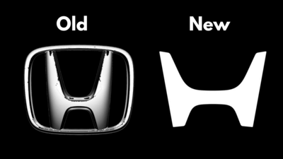
New Delhi: Honda Motor Co., Ltd. has revealed a new version of its well-known “H” logo for its car business. The logo was first used in 1963 and has appeared on Honda cars for more than six decades. Over the years, its design has been changed several times, but it has always remained a key part of Honda’s identity. The latest update gives the emblem a cleaner and more modern look, while still keeping the basic shape people recognise.
According to Honda, the new design is meant to match the company’s current design direction. The shape of the logo is inspired by two open hands, which Honda says reflects its focus on supporting customers and expanding the possibilities of mobility. The aim is not to break away from the past, but to adjust the symbol so it fits better with how Honda plans to move forward.
Which vehicles use Honda new logoThe new “H” logo will not appear on existing models immediately. Honda plans to introduce it on next-generation electric vehicles (EVs) and next-generation hybrid electric vehicles (HEVs). These models are expected to reach the market from 2027 onwards. Over time, the logo will also be used more widely to represent Honda’s car business as a whole. This includes dealership signs, official communication material and even Honda’s presence in automobile motorsport activities.
Also read: Honda new logo strategy
Why Honda came up with new logoHonda has explained that the logo change is linked to the major shift currently happening in the car industry. With electric powertrains and intelligent technologies becoming more important, the company sees this period as a fresh start, which it refers to as its “second founding”. Through the new logo, Honda wants to show that they are adapting to the changes and focus on new ideas and technologies, instead of sticking to older methods.