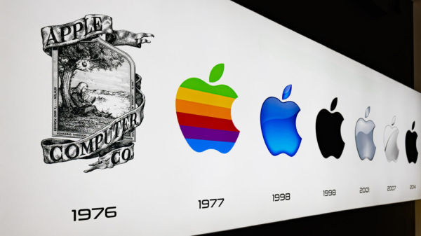
From the original Isaac Newton logo to the sleek flat logo we know today, Apple’s logo has evolved alongside the trillion-dollar company that started in a garage in Los Altos. The very first Apple logo was nothing like the bitten Apple design we’ve come to know, and instead was a drawing of Isaac Newton sitting under an apple tree, with a single apple over his head in a picture frame design. Around the perimeter of the frame is a quote from English poet William Wordsworth, taken from Wordsworth’s 1850 version of “The Prelude.” Designed by Ronald Wayne and Steve Jobs in 1976, the logo was featured on the Apple-1 operation manual, but was short-lived. Jobs felt the design was overly complicated and dated, even for the time. Jobs also anticipated the logo not scaling well, particularly at small sizes.
In 1977, Jobs commissioned a new logo from graphic designer Rob Janoff. The resulting concept was the famous color striped bitten apple logo, which would be used for over 20 years on products like the Apple II family, Apple Lisa, the first Macintosh computer, and the LaserWriter. This version of the logo featured a palette of six colors, which signaled the color display of the Apple II. Most importantly, however, was the bitten apple silhouette, which has endured ever since. The apple silhouette has undergone radical color changes, and even very slight revisions to the shape, but it has remained as the consistent visual identity for the Apple brand.
These early days and logos saw Apple not only trying to carve out a customer base, but also establishing a design philosophy based around simplicity, elegance, and creativity — tenets the company still upholds today, and that have contributed to Apple becoming a global tech lifestyle brand.
Rainbow, monochrome, and the Aqua era: 1977, 1998, 2001
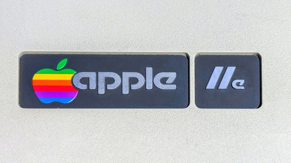
Janoff’s rainbow apple logo served the company from 1977 to 1998, although Landor Associates tweaked the shape in 1984 and dropped the “Apple” wordmark in favor of just using the icon. When Steve Jobs returned to Apple in 1997, he would end up not only saving the company, but reinventing it with the first iMac computer: the now-classic iMac G3. The iMac G3 sported a new — although short-lived — translucent logo on the case. During the second Jobs era, Steve Jobs simplified everything underneath the Apple brand to focus on a handful of core products. With this new strategy came a new logo to echo the simplicity mandate; gone were the rainbow colors, replaced by the minimalist monochrome silhouette. Every logo evolution would use the same unchanged monochrome silhouette, but focus on different textures or renderings.
The monochrome logo also had benefits over the multi-colored version, namely that it could be easily incorporated into various product and marketing materials, and was used in colors like black, white, chrome, and red. In 2001, Apple’s logo would get another surface treatment, this time moving to a glossy, somewhat three-dimensional motif, becoming known as the Aqua logo, as it was modeled after the Aqua design language used in Mac OS X (which was based on the architecture of NeXTSTEP), arguably the most important operating system in Apple’s history.
The glossy Aqua era also coincided with the early 2000s UI and hardware stylings, and reflected the skeuomorphic design trends of the time. These versions of the logo, sometimes with a chrome look, appeared in Mac OS X startup and splash screens, and on products like the iMac G4. This era of the logo also marked Apple’s shift towards a premium tech brand.
The Apple Inc. name change and the metallic, flat, and modern logos: 2007, 2015 to present
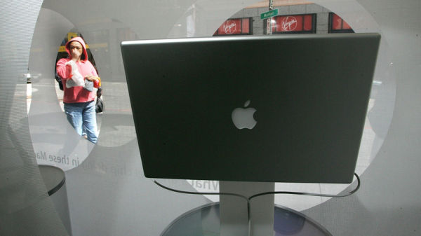
In 2007, the Apple logo became metallic, a nod to Apple’s designs moving to the use of premium materials, like aluminum. Versions of this logo would feature either a brushed or polished metal texture, or a glassy effect. Apple would also change its name in 2007 from Apple Computer to Apple Inc., highlighting the company’s shifting focus to not only include personal computers, but also consumer electronics like the iPod and iPhone. The brushed metal logos could be seen on the iPod, iPhone, and on the iMac G5 — the latter of which would form the design cornerstone for modern iMac models. Apple’s use of premium materials — a core design philosophy of legendary designer Jony Ive — would continue from this point on, and go on to include glass and titanium.
Between 2013 and 2015, Apple’s logo shifted to a minimalist, flat design. This was part of a broader design trend happening throughout the mid-2010s, moving away from earlier skeuomorphic designs in favor of flat design elements that are more streamlined and responsive and will scale well across different materials and screen sizes. The flat Apple logo usually appears in one of three colors: back, white, or silver. Apple would also overhaul iOS with a flat design beginning with iOS 7, and Mac OS would get the flat design treatment with Mac OS Yosemite.
The Apple logo has become one of the most recognizable brand icons in history, along with others, like Nike’s swoosh. The Apple logo has also spawned a number of myths about its design, such as biblical references or the reason the logo has a bite taken out of it.